Moving Brands

Tuesday, 3 April 2012

One company that i completely idolise is Moving Brands, based in London and all over the place really. I love their work and its something that i would love to get involved with if i could.
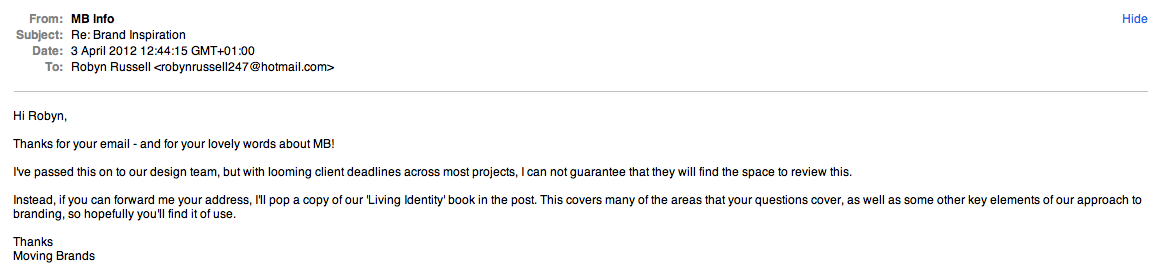
So using my DC Publication as an excuse i got into contact with them to try and see if i could get a response. I emailed them, possibly the most kiss ass email ever but every word was meant! And i got a response which was amazing. So happy.

____

_____


Once i have received the book, as a thank you i am going to send one of my prints down to them to show i appreciate them and hopefully i can keep in contact with them in the future. 

All

Monday, 2 April 2012

At the moment i have designed my busniess card, letterhead, invoice, website, portfolio and CV. Now i have my brand i want to try and focus on adding some tactility to the design so im in the process of investigating getting a wax seal and emboss stamp.


Beautiful Meme Visit

Tuesday, 21 February 2012

I visited Beautiful Meme today, it was a great chance to see the studio and how it all works. I got to meet Rhianne and the rest of the team and go through my portfolio, which was really helpful. She also showed me how they work and what they do, which was really insightful and has helped me see myself working with them. So now im even more excited.
Rhianne suggested that it might be good to try and do a full month with them, which i defiantly think is the best idea and this way it gives me the opportunity to really experience the working environment, for a long period of time. I cant wait now. I sent my dates through and Rhianne agreed, so im going to do a month with them over summer as soon as I finish uni. This way i can go straight into something, instead of worrying about what im going to do. It will be a distraction from starting life in the real world!


Beautiful Meme Placement

Wednesday, 15 February 2012

It was really exciting today i received an email from Rhianne at Beautiful Meme, who had been passed on my details by Ben. Offering me a placement with them for whenever was good for me, i just have to go see them on friday. I am so happy and excited, and cant wait to go see them and discuss when we can do it!


Hunt Studio

Monday, 30 January 2012


Hunt Studio is a Melbourne based multi-

disciplinary design consultancy that is
skilled in brand identity and development,
art-direction, packaging, environmental design,
printed matter, online and interactive design.

We pride ourselves on our exceptional attention
to detail, and a unique process we bring to each
and every one of our projects. We understand the
importance of the client–designer relationship
and commit to delivering our design ideas and
visual solutions to the highest possible quality.
We are driven by passion and we are committed
to design excellence.


Marquee Wines

Identity & Branding


Marquee Wines approached Hunt Studio to develop a brand and visual identity for its boutique wine importing business. The company imports high-end wine primarily from France, Spain and New Zealand. The identity includes a debossed logo depicting an empty wine cellar (with the exception of two bottles). The reverse of the logo inverts and shows the rear of the bottles creating a tactile experience on every part of printed collateral.


Wine Concepts

Identity & Branding
Hunt Studio was asked to develop a new identity and branding for Melbourne-based wine consultants, Wine Concepts. The logo represents a stylised wine label and has been foil stamped on business cards cut from Steven Swiss White stock. The collateral features overprinted wine drops to reinforce the brand and emphasise the product.


Hunt Studio (Identity)

Identity & BrandingAfter a recent move, we took the opportunity to revisit and refresh our own studio identity. Although it still retains the original image and core values, the new identity reflects our progress as a studio. We also took this opportunity to recycle our previous printed collateral, triplexing our former promotional pieces between our new business cards and postcards.
Printing by Taylor’d Press


Six


From the Editor
It was only 4 days ago that Six updated their website with new work for the first time in years (actually a year – it always sounds more dramatic when you exaggerate things!) So far there has been very little press, so obviously I had to jump in on action whilst I had the chance. Not willing to settle with the “tiny” images on their site and subsequently throw a quick post together, my homeboy Darren Firth sent me a generous selection of high res images covering their most recent work and some older favourites which equally deserve a mention.
Hope you enjoy this feature and cheers again to Darren for giving me the honor of resizing each image myself ;)
Background
Six is an independent creative consultancy based in the UK, providing design and art direction for brand, print and screen. Concentrating on strong ideas, solid research, clear strategic thinking and attention to detail, Six develop collaborative relationships with their clients and partners to create original, distinctive work that engages users, satisfies clients and meets the high standards and innovation and creative excellence that are central to the studio practice.


Projects
—Dropyx
Identity and printed collateral
Printed 2 colour, with overprinted logo on Pale Grey Colourplan by GF Smith
—Johnson Tilley Associates
Identity and stationery
Printed in JTA’s primary green and purple, two new brand colours created uniquely for JTA. Printed on Colourplan Cool Grey by GF Smith
—Johnson Tilley Associates
Brochure
Printed in 7 colours, with dust jacket in Colourplan Cool Grey, and an inner cover in Colourplan Amethyst both by by GF Smith. The inner cover features technical diagrams taken from the design and production stage of JTA’s product development which have been printed in a silver metallic ink.
—Brandfluent
Identity and stationery
Printed one colour, with the logo in a matte platinum foil on a combination of Pistachio and Damascus Green Colourplan by GF Smith.
—Loake
Brochure 2009
Printed on GF Smith Colourplan stock with a gold foil on the front cover
—Groove Effect Posters
Posters
Finished with metallic and high bright inks, black foil and printed onto Zen Pure White.


Luxury

I really love this work, i think the intricate type on a format that allows it to be so detailed and fragile yet within a solid geometric shape really creates a publication that is attractive and tactile. Everything that i want to create with my work. They work heavily around concept driven design, that leads to using process to put that concept across which is exactly what i am about. 

THE LUXURY OF PROTEST IS THE NOM DE GUERRE OF LONDON-BASED DESIGNER AND ARTIST PETER CRNOKRAK. ESTABLISHED IN 2009, THE PRACTICE IS AN EXPERIMENTAL DESIGN PLATFORM THAT DEVELOPS BOTH COMMERCIAL AND CRITICAL DESIGN PROJECTS THAT TRANSCEND TRADITIONAL REFERENCE POINTS OF PURPOSE AND AUTHORSHIP WITHIN THE PROFESSION. PROJECTS ARE CONCEPT DRIVEN AND UTILIZE DESIGN LANGUAGE TO COMMUNICATE MEANING IN COMPLEX SYSTEMS. THE PRACTICE IS A CONTINUAL CROSSOVER BETWEEN ART, DESIGN AND NEW TECHNOLOGIES WITH WORK THAT ADDRESSES CULTURALLY RELEVANT THEMES INCLUDING GEOPOLITICS, GENERATIVE AESTHETICS AND THE INTEGRATION OF SCIENCE AND ART.
 - 

THE LUXURY OF PROTEST HAS BEEN FEATURED IN OVER 90 BOOKS AND MAGAZINES, HAS HAD WORK EXHIBITED IN LONDON, BERLIN, TOKYO AND NEW YORK, AND HAS WON A NUMBER OF INTERNATIONAL DESIGN COMPETITIONS INCLUDING AIGA 365, ISTD AND THE EUROPEAN DESIGN AWARDS. GRAFIK MAGAZINE FEATURE PROFILED THE LUXURY OF PROTEST IN THEIR MAY 2011 ISSUE. THE INFLUENTIAL DESIGN CULTURE JOURNAL PROTEIN, INTERVIEWED PETER CRNOKRAK FOR THEIR INSPIRATIONAL DESIGNERS SERIES.

IN 2010, PETER WAS MADE A FELLOW OF THE ROYAL SOCIETY OF ARTS IN RECOGNITION OF AWARD WINNING EXPERTISE IN DESIGN AND DATA VISUALISATION. EVERYONE EVER IN THE WORLD WAS AWARDED IN THE 2010 INTERNATIONAL SCIENCE & ENGINEERING VISUALIZATION CHALLENGE, WON A PREMIER AWARD FROM THE INTERNATIONAL SOCIETY OF TYPOGRAPHIC DESIGNERS AND WAS PUBLISHED IN THE PRESTIGIOUS JOURNAL SCIENCE.
"My good friend Peter of The Luxury of Protest is always knocking it out of the park with his highly detailed and intricate data visualisation prints and whilst his latest offering is based on a previously existing design, what differs this time however is the extra-special production of the piece itself — laser engraved and laser cut!
As Pete explains:
“I’ve been awarded a win in the National Science Foundation, International Visualization Challenge – this is competition founded by the NSF (the main science funding body in the US) and the prestigious journal, Science. All winners are published in the current issue of Science and can been seen here.
To commemorate the win I decided to print a final and super special edition of ‘Everyone Ever…’ The entire poster is laser engraved and laser cut in BFK Rives 100% cotton 300gsm white paper. The results came out beautifully and the edition is limited to 5 posters only.
I’ve gotten many requests for a 3rd edition after the first two sold out, but didn’t want to simply belt out another ink + paper variant. The competition win and publication in Science was a good impetus to create something really special.”
To learn more about the design and rationale behind ‘Everyone Ever in the World’ I recommend you check out this previous post. For your chance to own one of these highly limited, exquisite prints head on over to the Luxury of Protest online store."


This project: PROCESS / FORMAT—1ST EDITION: SCREEN PRINT GLOSS TRANSPARENT INK ON GFSMITH PLASMA POLYCOAT 700 MICRON MATTE JET BLACK PLASTIC (SOLD OUT). 2ND EDITION: SCREEN PRINT GLOSS MILK-WHITE INK ON GFSMITH PLASMA POLYCOAT 700 MICRON CLEAR NATURAL PLASTIC (SOLD OUT). PRINT BY K2 SCREEN, LONDON.

NEW : COMMEMORATIVE SCIENCE EDITION: LASER ENGRAVED AND LASER CUT PRINT ON RIVES BFK 300GSM 100% COTTON PAPER. SPECIAL LIMITED EDITION OF 5 PRINTS, BY CUTLASERCUT LONDON.

SIZE—650MM X 920MM : QUANTITY—20 / 20 / 5 : DATE—2010 TO 2011

PUBLICATION—ISTD CATALOGUE, SCIENCE, IDEA MAGAZINE, DE:BUG MAGAZINE, +81 MAGAZINE, COUPE DESIGN ANNUAL, DESIGN ELEMENTS, GRIDS 2ND ED., COMPUTER ARTS PROJECTS, INFORMATION GRAPHICS, SELECTED B, GRAFIK, IDN, KRAUT MAGAZIN.

EXHIBITION—+81 GALLERY+LAB 2010, EXPERIMENTAL GRAPHIC ARTISTS 2010.

AWARD—NATIONAL SCIENCE FOUNDATION AND SCIENCE :INTERNATIONAL SCIENCE & ENGINEERING VISUALIZATION CHALLENGE. INTERNATIONAL SOCIETY OF TYPOGRAPHIC DESIGNERS 2011, PREMIER AWARD.