John Lewis wanted to create a new menswear range of authentic clothing with a heritage feel, timeless and classic. They approached Egelnick and Webb based on our reputation working with fashion brands; House of Holland, Matthew Williamson and Jaegar.
Our first step was to visit the John Lewis archive which holds a wealth of material which we were able to draw inspiration from: collections of hand-printed swing tickets, a Ticket writers guide from the 1950′s, the detailing and typesetting of past collections, brochures form various stores around the country. What struck us immediately was the genuine heritage and strength of the John Lewis brand, established in 1864, it sat along side brands like Burberry, Barbour and Hunter in its place in history.
We created a brand positioning based upon this credibility and provenance, which we then rolled out across a collection of garment labels and swing tickets and extended to the in-store concept and provided a starting point for the art direction.
Font used: Goudy Old Style
___________________________________
// Processed labels really interesting affect, can be achieved with laser cutter and overlaying.
________________________________________________
Matches launched a capsule collection of limited edition pieces commissioned from a range of global fashion brands. We were asked to create a sub brand that would encourage sales at a higher price point than their core range, primarily online. We developed the name and reinforced the exclusivity of the products by developing a site that linked directly to sales and so counted down in real time as items started to sell out.
Given the premium product value, we elevated their usual, functional product photography to create a more aspirational level of beauty to the pieces that highlighted key detailing. The brand look and feel was then rolled out to offline application in-store and at launch events.
// Simple emboss, clean effect on mottled stock
‘Now celebrating the opening of their third store, North East London clothing boutique HUB approached us to refine their brand identity, in need of some TLC. We created a simple, iconic, ration book chic aesthetic. The brand identity developed for HUB was applied across all online and offline marketing materials and and post-sale merchandising; the bags and gift-wrap. Our primary focus for the store interior design was to ensure that the brand identity was delivered in-store.’.
Boutique by Jaeger is a new younger, fashion-forward diffusion line launched in July 2010. The brand identity developed by Egelnick and Webb has been cohesively used across all communications, including advertising, look books, website, swing tickets, labels and in-store.
‘Fashion’s duo Aganovich opened Paris Fashion Week in March. For another consecutive season, Egelnick and Webb worked with the Parisian Label for their AW 2011 show.
The Rubik’s cube inspired invitations, designed by Egelnick and Webb echoed the shades of blue used to define the collection for AW 2011. The show demonstrated a clear progression from ‘Rhapsody in Blue’ SS 2011, lighter shades of blue against cerulean for added definition. The collection itself championed modernity, alluding to something out of this world.
Aganovich are recognized for bringing a cerebral and complex point of view to the runway. Egelnick and Webb successfully designed the Lookbook to celebrate this very point of view delivering Aganovich’s design philosophy; ‘anarchy through elegance.’
House of Holland shot to fame when Gareth Pugh and Giles Deacon donned his t-shirts at the end of their SS 07 shows; now he not only has a diffusion collection in Debenhams but his London Fashion week reviews just keep getting better and better.
We have worked with Henry since 2008; first working on his show invites and look books. We have since designed and built his website, an app for Blackberry and work on his full social media strategy which involves both applications for Facebook and the iPhone; ensuring that all communication is succinct and relevant and irreverently Henry.
Font Used: Franklin Gothic
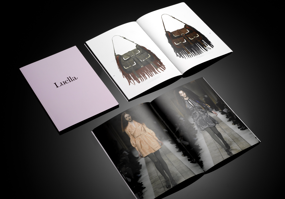
Hard to believe that it’s been nearly 3 whole years since Egelnick and Webb were featured on SI! In that time they’ve amassed a large collection of brand new work, much of which I’ve been given the pleasure of showcasing in today’s feature. There’s some really great pieces of work on display here and if I were to pick a favourite, it would probably be the banana-leaf invites :) – I don’t know about you, but there’s something about the contrast of the gold typography with the whimsical nature of the banana-leaf that I find so appealing :)
Nevertheless I hope you enjoyed this feature and thank you once again to Luke and Alex @ E+W for the imagery. A few more images will be added later on in the day, so keep your eyes peeled (no pun intended) ;)
Egelnick and Webb are a multi disciplinary design agency based in London, who work with a broad range of clients, mainly in the fashion and luxury sector. The launch of their new website is just around the corner!